
 Maybe you feel like your logo is just a fancy way of writing the company name. Or that updating your logo is a waste of time and money. If you feel this way, you'd be wrong. Your logo is important. Not only is this the first impression most people have of your company - it's on your letterhead, business cards, brochures, website, social media and signage after all. It's also the one image that stands for your company. And to paraphrase - an image is worth a thousand words.
What's the feeling you have when you look at this American Eagle logo? The aim was to create a feeling of childlike exploration and freedom - using the eagle as the ultimate symbol of freedom and including retro graphics harking back to the childhood age of the target audience. Not only does the retailer want their customers to connect with their logo, they want to create an emotion related to their brand. Starting with their logo and extending through their branding, the retailer encourages their customer to relate American Eagle to good feelings - the freedom of childhood. A strong logo allows you to rise above the competition. It sets you apart from the crowd. A good logo is memorable and appropriate. It sends the message you want to send and it creates a feeling among those who view it. What feeling do you want to create for your company? Strong? Compassionate? Technologically advanced? Experienced? Your logo should reflect the emotion you want your customers to feel. Every element of your logo helps convey this feeling, helps create a great first impression and helps cement these emotions in your customers' minds. Let's talk about your logo and how it can be refreshed or redesigned to promote your company in the right way. Call Admarc.
0 Comments
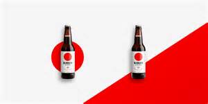 Apple is the king of clean design - elegant, simple, uncluttered. No bells and whistles - simple sophistication. Clean design is definitely having a moment. Check out the shelves on your next shopping trip. Logic would have it that the loudest, brightest packaging would draw the most attention. But you will notice that the simple, subdued design draws you in as well. It can feel like a moment of calm in the midst of your crazy day.
You might think that "simple" means "easy". But you'd be wrong. Simple design is exponentially more difficult than "in your face" advertising. With clean design, each element carries more weight. No hiding behind loud colors, crazy graphics or weird fonts - "simple" demands real talent. Clean design requires each detail to be considered, thoughtful and exact. Simple is definitely not easy. Radmir Volk's portfolio is a great example of clean package design. His packaging (unlike R.E.M.) doesn't say too much or not say enough. Give Admarc a call if your design could use a little simplification. We have the know-how to say exactly what needs to be said - no more, no less. How is your company logo looking? A little tired? A little past its prime? Your logo is the face of your company - maybe it needs a little "nip tuck" to bring it up to date? We are experts at logo design and logo refresh. Admarc creates logos that look like a million bucks.....and we rarely charge $211 million to design them. |
Admarc
Fresh insights shared in the morning when ideas are fresh and the coffee is hot. Archives
July 2023
Categories
All
|
 RSS Feed